02 · 2024 · Design Sprint · Nonprofit · Web Design
Paws for Hope.
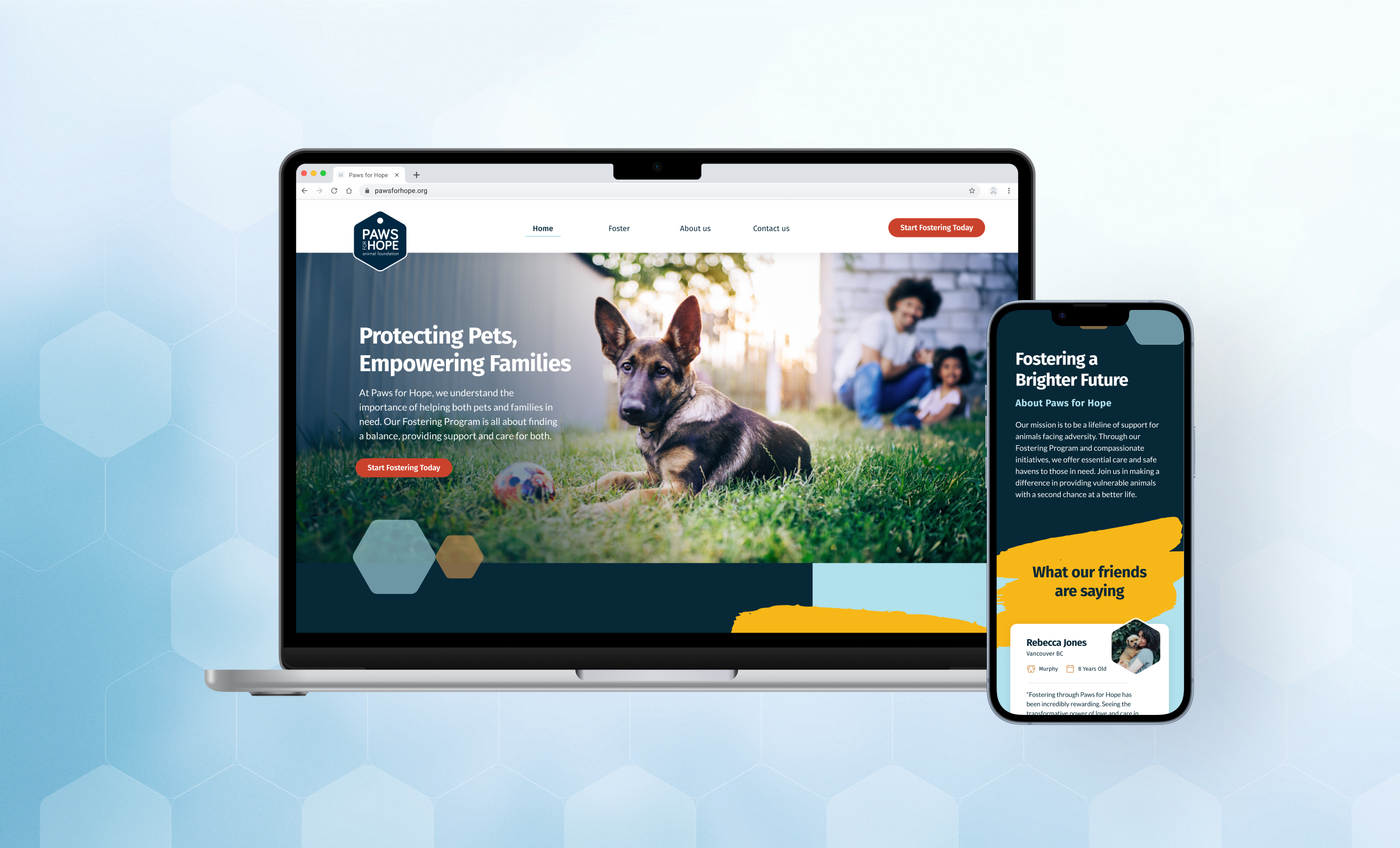
Website redesign for a nonprofit in BC, Canada.
Role
UX/UI Designer
Type
Design Sprint · 5 days
Team
Jinyi Liu, Shreya Aneja, Valencia Liu
Tools
Figma, FigJam
01 · The problem
Improving the lives of pets in BC
Every year in British Columbia thousands of pets are surrendered to community rescues. Paws for Hope combines animal welfare with social services so no pet gets left behind, but its fostering programme was hard to understand and harder to act on.
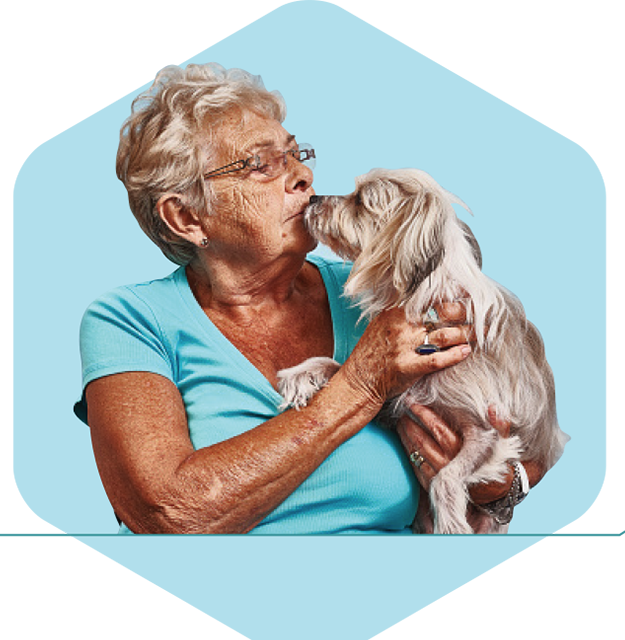
Nowhere to turn
Families with a pet in distress often feel they have no support system to reach for.
Cost of living
Inflation makes caring for a pet financially precarious for households already stretched thin.
Housing crisis
People are abandoning animals because they cannot find pet-friendly housing.
02 · Framing the sprint
Preliminary
How might we help social impact organizations express their value, and inspire people to take action in order to drive positive change?
Revised, after research
How might we encourage families in BC to foster pets & provide a loving home for them, so we can reduce the number of animals in shelter?
03 · What we learned
Empathy is easy. Acting on it isn't.
Pain points
- People worry about affording the financial responsibility of a pet.
- Homes aren't pet friendly, and deposits are often required.
- People worry about getting too attached to the pets.
Motivators
- People love having pets in their home.
- Fostering animals positively impacts quality of life.
- Fostering is a low-commitment trial run for people considering adoption.
Behaviours
- People would like to foster but can't take on the responsibility.
- Most people feel empathetic towards animals but rarely convert that into action.
04 · The persona

Meet Ella.
Ella loves animals, especially dogs, and wishes she could adopt one, but she isn't sure she is ready to commit to owning a dog yet. Fostering is the trial run she doesn't know she is looking for.
Pain points
Uncertain she can afford the financial cost of a pet. Unsure she is ready for the time commitment with a demanding job.
Motivations
Fostering could give her clarity on whether she is ready to own and care for a pet.
Behaviours
Grew up with a family pet. Travels every few years.
“Considering the dedication and expenses involved, I'm not sure if having my very own pet is in the cards for me. But hey, I'd totally give fostering a shot and see how it goes!”
05 · Design decisions
Keep the brand. Fix the journey.
While we admire Paws for Hope's current visual identity, we identified the need for some UX-driven changes.
What works well
- Colour palette
- Typography
- Imagery
- Navigation
Even better if
- Clearer informational hierarchy
- Concise storytelling
- Button shapes aligned with brand personality
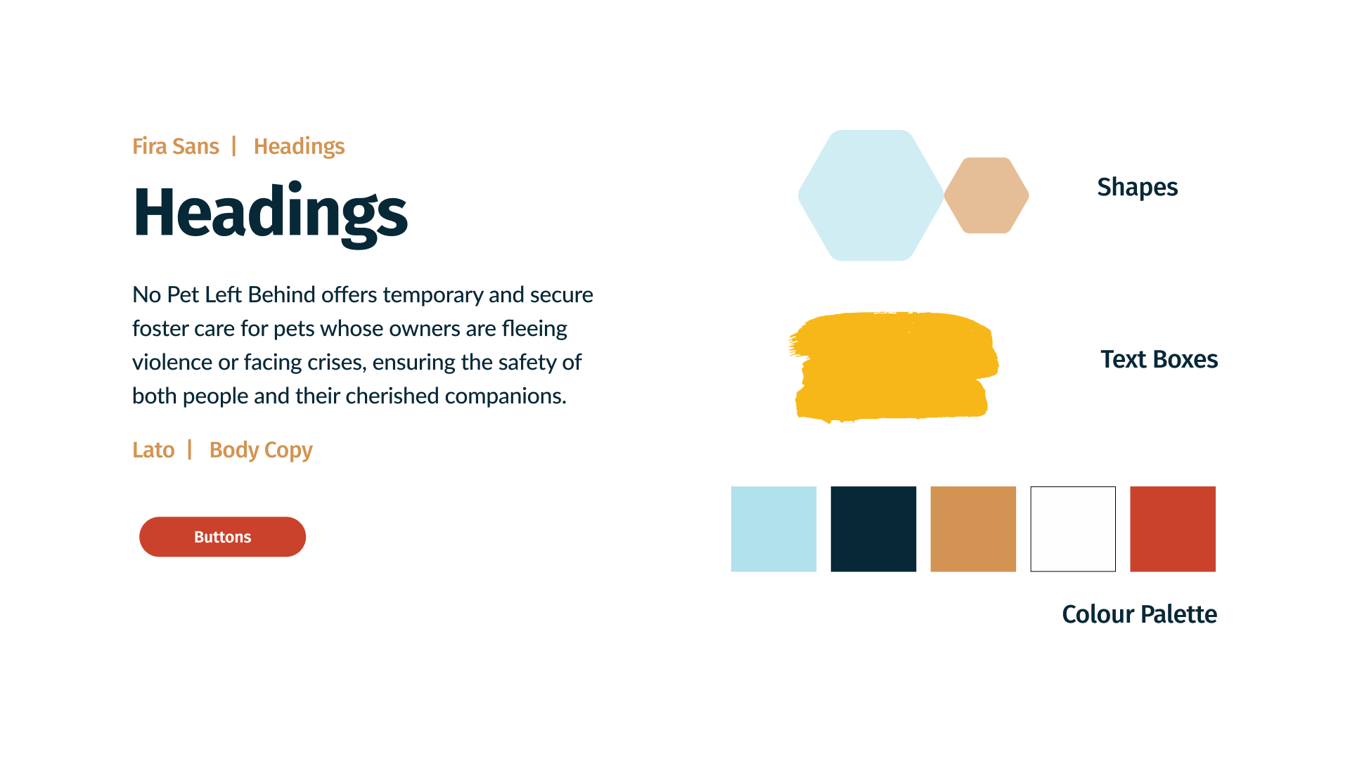
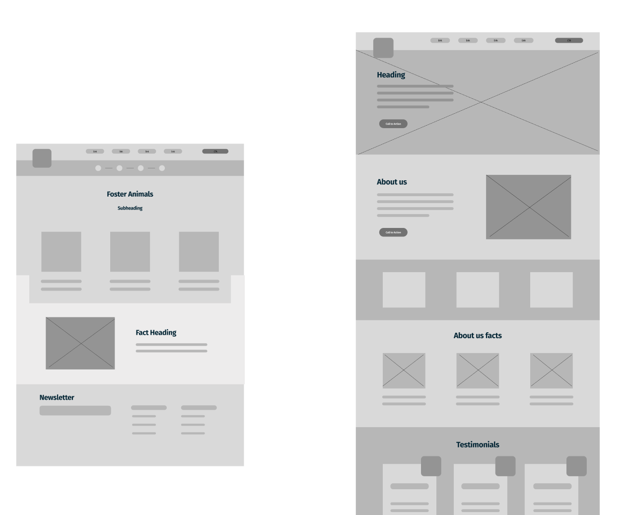
A hexagon-led system built from the foundation's own brand mark.
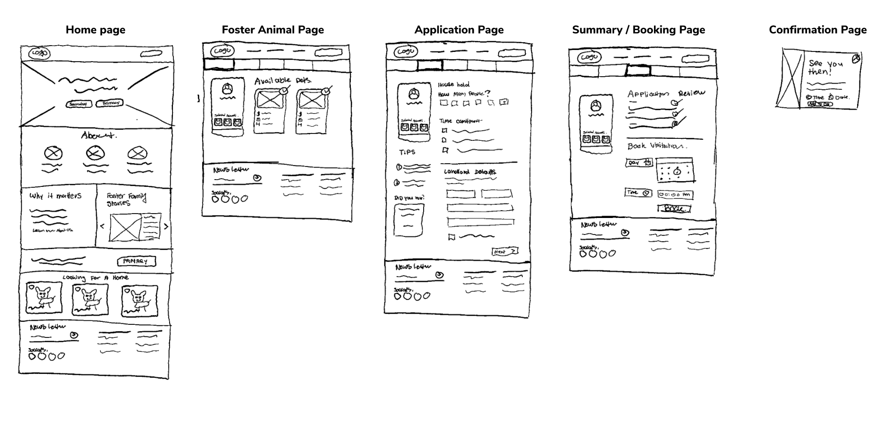
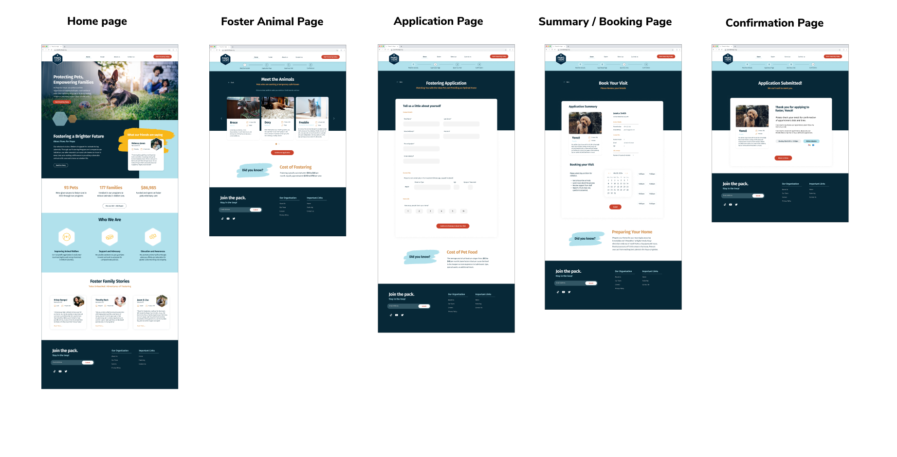
The shipped flow
Browser to browser: home page, meet the animals, application, booking, confirmation.
Try the prototype
Home page to booking confirmation, exactly as it was tested.
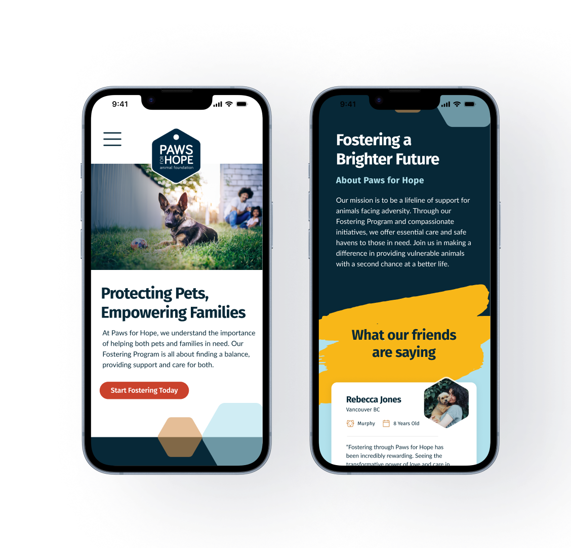
Responsive by default
The same fostering flow holds up on a phone: hexagon accents, brush-stroke headings and a single primary action per screen.
06 · User testing
Five sessions, five tasks, one prototype.
We watched where people hesitated and let the quotes write the fix list.
- Task 1 Start the foster application
- Task 2 Choose a pet
- Task 3 Fill out the application
- Task 4 Schedule a day and time to visit
- Task 5 Return to the home page
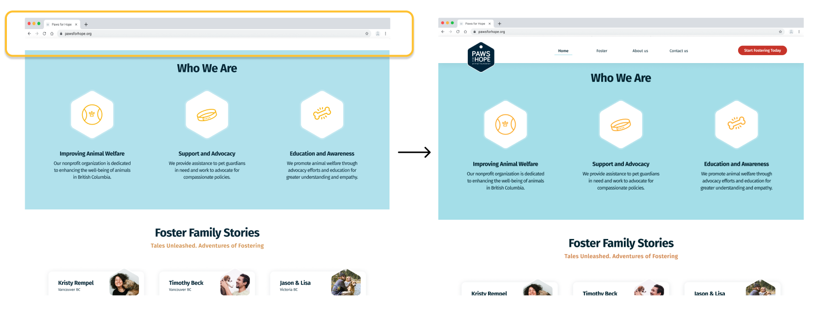
Home page
“I would like to access the navigation bar when I scroll down.”
Navigation became sticky on scroll, so the way out is always in reach.
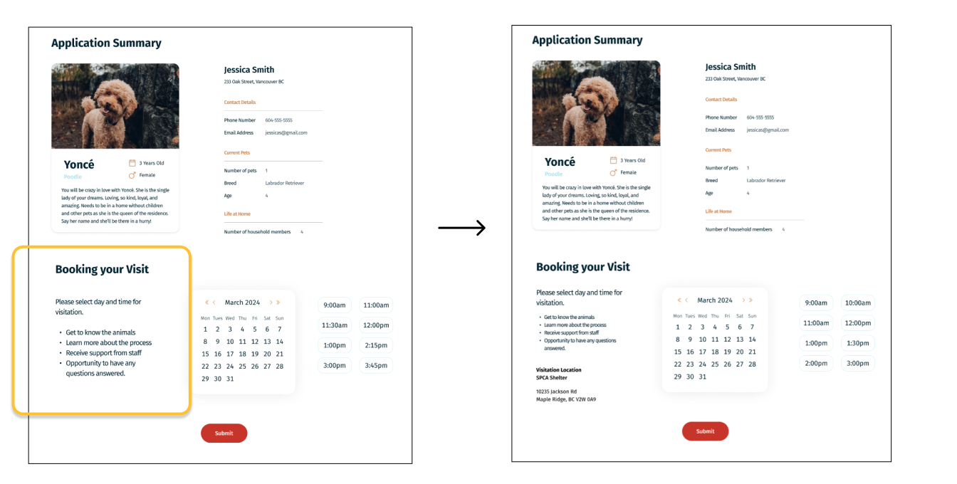
Visitation page
“I'm not sure where I'm visiting. Am I going to the shelter?”
The booking summary now names the visitation location and address outright.
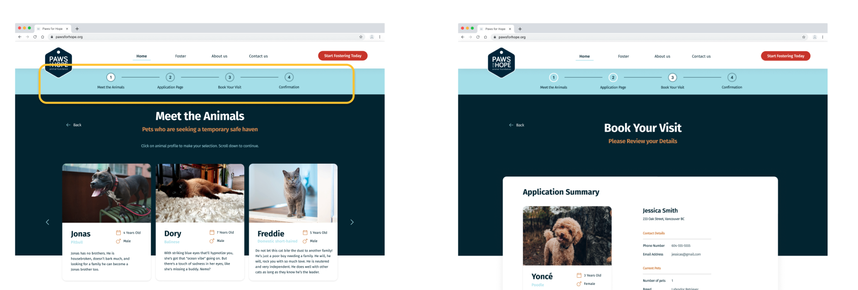
Progress bar
“I want to navigate and go back by clicking on the numbers.”
Each step of the progress bar became clickable, in both directions.
07 · Outcome
5
days, concept to prototype
5
tasks tested per session
3
usability fixes shipped