hi, I'm Shreya
A human-centered
visual designer.

move your cursor & scroll to explore

UX design + research

Currently based in
New York, NY

UX Research Service Design Conversational AI Design Systems Prototyping Usability Testing Accessibility Data Storytelling

01 · 2025 · Digital Health · AI Guidance · Multilingual UX

BloomWell.

an app for culturally sensitive SRH learning.

Role
UX/UI Designer & Researcher
Course
INFO 5355 - HCI
Team
Valencia, Kimmy, Shreya
Tools
Figma, FigJam, Maze
BloomWell — an app for culturally sensitive SRH learning

the problem

Bridging the gap for immigrant women

Young women who immigrated from Asia to study in the US need reliable, secure information and providers who understand cultural sensitivities around sexual and reproductive health so they can be autonomous when seeking care.

Stigma

Cultural silence in traditional families pushes reliance on external, often unreliable sources.

Language

Complex medical terminology and missing multilingual resources block comprehension.

Privacy

Fear of digital traces and social judgment prevents women from seeking information at all.

what we learned

  • 1

    Users grew up in families where SRH was “impolite” - information came from outside the home.

  • 2

    Credibility was hard to verify in English; medical terms lost their cultural context in translation.

  • 3

    Users wanted anonymous, encrypted, non-judgmental spaces to ask sensitive questions.

  • 4

    Real-life scenarios beat long clinical articles for navigating US healthcare and insurance.

BloomWell high-fidelity screens: homepage, health library, play & learn, AI chatbot
Final high-fidelity screens - soft gradient palette, credible health typography.
BloomWell project poster with problem statement, persona and prototype screens
The full research-to-prototype poster.

approach

  1. 01

    Research

    6 semi-structured interviews with Asian women (18–24) at Cornell, a competitive audit of 8+ SRH apps (Flo, Clue, Nurx, Planned Parenthood) and affinity diagramming on FigJam.

  2. 02

    Solution space

    Mapped 55 design ideas across digital, physical and hybrid modes, then narrowed to three tasks: AI Chatbot, Multilingual Health Library, and Play & Learn.

  3. 03

    Prototype

    Paper sketches to low-fi wireframes to a medium-high fidelity Figma prototype - each task built as a vertical prototype with complete end-to-end flows.

  4. 04

    Evaluate

    Moderated think-aloud usability tests plus a 24-point heuristic evaluation drove three major iterations: a completion page with score, an AI model picker and privacy popup, and translation expanded across every feature.

outcomes

24

heuristic issues found

15

usability issues identified

3

major design iterations

reflection

Cultural sensitivity is not a feature - it is a foundation. Privacy reassurance, multilingual support and a non-judgmental tone had to be woven into every interaction, never added afterwards.

View the full case study

02 · 2026 · Conversation Design · GenAI · Usability Testing

Assurant.

IVR customer experience design for a fortune 500 global business services company specializing in specialty insurance and risk management products.

Role
UX Researcher & Conversation Designer
Type
Industry Practicum · Cornell Bowers CIS
Timeline
Feb to Apr 2026 · 4 phases
Testing
15 Wizard-of-Oz sessions, 2 rounds
Assurant — IVR customer experience design for a fortune 500 global business services company specializing in specialty insurance and risk management products

the problem

Callers are exhausted before the AI ever speaks

Assurant's Auto IVR already runs a working Gen Agent for rental car questions - a foundation, not a blank page. But callers move through a long, un-interruptible disclosure, a caller-type menu and an identification ladder before the agent says a word, and nothing they've already given is passed forward. Our brief: find where GenAI adds value, where it adds friction, and write the rules for turning it on.

Disclosure bottleneck

Long, non-interruptible legal text before any service interaction, callers lose patience before help begins.

Identification loops

ANI fail → phone number → VIN/contract → multi-match, with no clear rule for when to stop trying.

No context carryover

The Gen Agent doesn't know what the IVR already collected, so callers repeat themselves.

what we learned

  • 1

    Multi-match selection is the highest-friction moment in the flow: long voice lists cause confusion and “get me an agent” behaviour.

  • 2

    First-turn intent accuracy is the highest-risk metric: the same misclassification left one participant calm at 4/5 trust and collapsed another to 1/5.

  • 3

    Answers without a next step feel incomplete - “tell me the rule” scored far lower than “help me decide what to do”.

  • 4

    Short recoveries beat explanations: “I got that wrong, let me try again” outperformed every long apology we tested.

  • 5

    Across 6 competitors (Asurion, AppleCare, Lemonade, Progressive, Geico, State Farm), 82% of carriers use AI - but mostly back-office, not customer-facing. Rental car coverage is the right first branch.

Global Auto IVR entry flow: call start, greeting, language prompt, AI and privacy disclosure, then the GenAgent IVR gate
The as-is IVR entry map: greeting, language, a non-interruptible AI and privacy disclosure, then the GenAgent gate. This is the friction we redesigned around.

approach

  1. 01

    Discovery

    Competitive analysis across six insurers and device-protection peers, AI disclosure and consent research, and an analysis of eight pages of the Auto IVR call-flow architecture - annotating each node with friction, retry behaviour and containment risk.

  2. 02

    Design the gates

    A three-gate eligibility model: branch (supported DNIS route), scenario (rental eligibility, reimbursement, arrangement) and context (caller identified, contract or claim located). If any gate fails, the caller stays in the standard IVR - plus claim-status filtering so denied and closed claims skip GenAI entirely.

  3. 03

    Prototype the flow

    A nine-stage “to-be” flow - IVR entry, caller ID, record resolve, silent route, three-gate check, the Bridge, Gen Agent, IVR return, live agent - built as an interactive call-flow prototype with testing scripts and a Wizard-of-Oz tool.

  4. 04

    Validate & write the playbook

    15 sessions across two rounds (10 end-to-end, 5 on error handling), then a vendor-ready prompt table: what to say, what to avoid, and why, backed by the A/B data behind each line.

outcomes

100%

task completion across 15 test sessions

3.5→4.5

caller confidence, current vs. improved flow

6

recommendations handed to the client pre-pilot

reflection

Voice AI doesn't fail because the model is weak - it fails at the seams. One operating rule carried the whole playbook: get to useful help fast, be specific when answering, recover confidently when wrong, and transfer cleanly when a human is needed.

03 · 2026 · Service Design · Accessibility · UX/UI

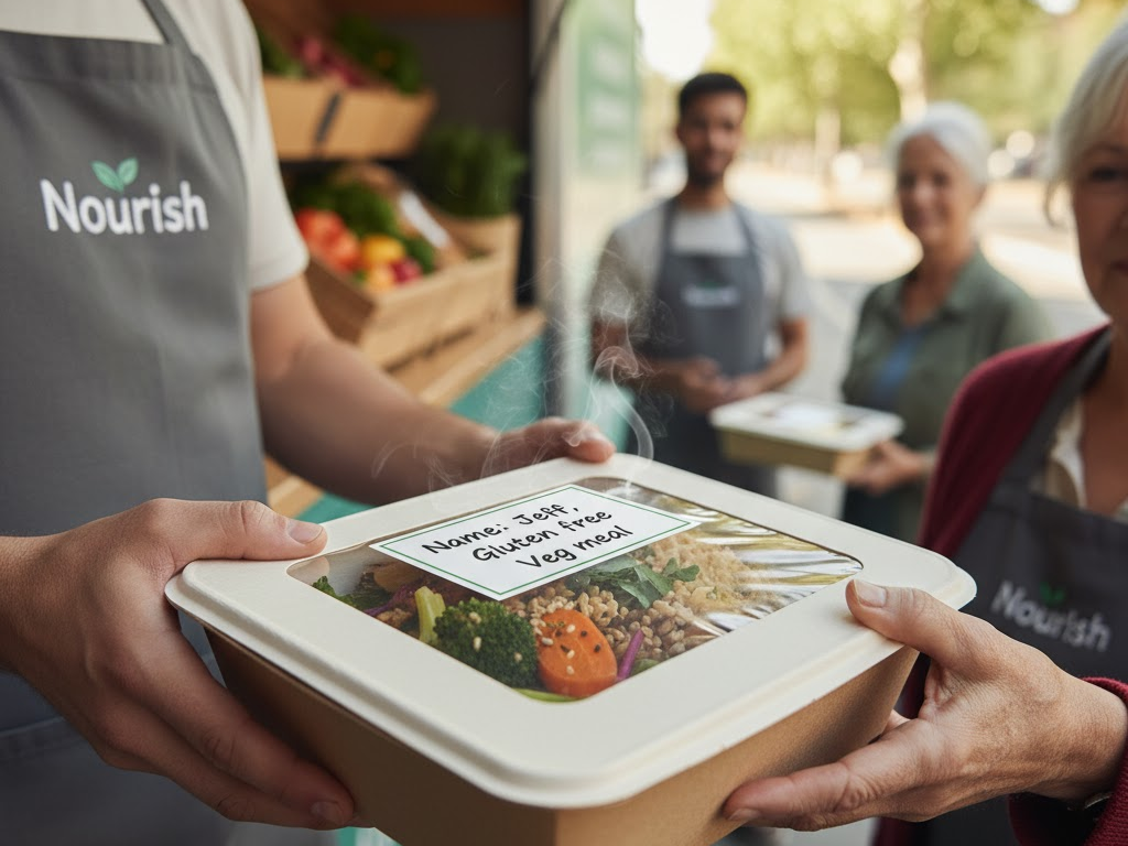
Nourish.

A mobile food pantry and hot-meals truck that reduces food insecurity for older adults - deliberately without apps, accounts or complex technology.

Role
UX Designer
Type
Service Design · Accessibility
Context
HCI Studio
Team
Ananya, Kelly, Lavanya, Shreya
Nourish — A low-tech food service for older adults

the problem

Effort is the real barrier

Grocery delivery and assistance programs assume smartphones, reliable internet and the energy to navigate complex systems. For many older adults, the effort required is the barrier - not the food itself.

Mobility & food deserts

Unsupportive built environments and distance from supermarkets limit access to fresh food.

Transportation

Thin public transit makes reaching food sources difficult without a personal vehicle.

Digital divide

Lower technology adoption makes app-based food services unusable for this population.

what we learned

  • 1

    Energy - not just access - is the hidden barrier to food security.

  • 2

    Trust and familiarity outrank speed and convenience for every participant.

  • 3

    Predictable schedules and plain language reduce anxiety more than more features do.

  • 4

    Human contact turns a transaction into a reason to show up.

Nourish website and tablet interface mockups
Weekly routes and Find Your Meal - shown on desktop and tablet.
Nourish truck serving ledge with accessible waist-high handoff
Waist-high serving ledge - no bending, climbing or entering.
Nourish community seating area beside the truck
Optional seating reframes pickup as a social moment.
Nourish research synthesis and affinity mapping session
Affinity mapping with caregivers and service providers.
Nourish brand mark
The Nourish identity: warm, plain-spoken, unmistakable.

approach

  1. 01

    Discover

    Market research plus interviews with older adults (60–78), caregivers and community service providers, using contextual inquiry, surveys and affinity mapping.

  2. 02

    Define goals

    Food access without apps or accounts; less physical and cognitive strain; dietary flexibility; trust through consistency; social connection; dignity preserved.

  3. 03

    Design the service

    Ordering by phone, paper form or in person. Same routes at the same times weekly, backed by printed schedules and reminder calls. A waist-high serving ledge so nobody bends, climbs or enters the truck. Optional seating turns pickup into a community moment.

  4. 04

    Evaluate

    Three rounds: provider and older-adult interviews, low-fidelity concept testing, and medium-fidelity testing of the website and truck visuals.

outcomes

3

rounds of evaluation

0

apps or accounts required

60–78

age range of participants

reflection

Designing for older adults is not only about removing barriers - it is about honouring dignity, conserving energy and building trust over time. Nourish reframes food access as a relationship, not a transaction.

Read the full write-up on Medium

04 · 2024 · Design Sprint · Nonprofit · Web Design

Paws for Hope.

Website redesign for a nonprofit in BC, Canada.

Role
UX/UI Designer
Type
Design Sprint · 5 days
Team
Jinyi Liu, Shreya Aneja, Valencia Liu
Tools
Figma, FigJam
Paws for Hope — Website redesign for a nonprofit in BC, Canada

the problem

Improving the lives of pets in BC

Every year in British Columbia thousands of pets are surrendered to community rescues. Paws for Hope combines animal welfare with social services so no pet gets left behind - but its fostering programme was hard to understand and harder to act on.

Nowhere to turn

Families with a pet in distress often feel they have no support system to reach for.

Cost of living

Inflation makes caring for a pet financially precarious for households already stretched thin.

Housing crisis

People are abandoning animals because they cannot find pet-friendly housing.

what we learned

  • 1

    Pain point - people worry about affording the financial responsibility of a pet.

  • 2

    Pain point - homes aren’t pet friendly and deposits are often required.

  • 3

    Motivator - fostering is a low-commitment trial run for people considering adoption.

  • 4

    Behaviour - most people feel empathetic towards animals but rarely convert that into action.

Paws for Hope prototype overview: home, foster animal, application, booking and confirmation pages
The end-to-end fostering flow - five pages, one continuous journey.
Persona slide for Ella Evans, a 28-year-old QA engineer in Vancouver
Ella - curious about ownership, ready to foster first.
Research synthesis of pain points, motivators and behaviours
Synthesis: pain points, motivators, behaviours.
Paws for Hope visual system: typography, shapes and colour palette
A hexagon-led system built from the foundation’s own brand mark.

approach

  1. 01

    Frame

    How might we help social impact organizations express their value, and inspire people to take action in order to drive positive change?

  2. 02

    Research

    Secondary research on BC shelter capacity plus user interviews, synthesised into pain points, motivators and behaviours - and into Ella, a 28-year-old QA engineer who wants a dog but isn’t ready to own one.

  3. 03

    Design

    Wireframes for home, foster animal, application, booking and confirmation pages, layered with a hexagon-led visual system: Fira Sans headings, Lato body, deep navy, sky blue and ember accents.

  4. 04

    Test & iterate

    Usability testing produced three fixes: a sticky navigation on scroll, a clearly labelled visitation location on the booking summary, and a clickable progress bar so applicants can move back through steps.

outcomes

5

days, concept to prototype

5

pages in the fostering flow

3

usability fixes shipped

reflection

A nonprofit’s hardest design problem isn’t explaining what it does - it’s lowering the cost of the first step. Framing fostering as a trial, not a commitment, changed the entire information architecture.

Open the design sprint deck

who am i

Portrait of Shreya Aneja
My background
I'm a UX designer and researcher based in New York, with 3+ years across user research, usability testing, information architecture, wireframing and prototyping. My work moves between digital health, service design and conversational AI, problems where the research is messy and the stakes are human.
My approach
A design background from CCA and an information science lens from Cornell inform a practice that blends listening with making, turning qualitative and quantitative signals into personas, process flows and interfaces people can actually trust.
My experience

2025 – 2026 · MS in Information Science, UX Design, Cornell University

2026 · Digital Innovation & E-commerce Intern at Richemont

2026 · UX Researcher & Designer at Assurant, Cornell Sponsored Project

2025 · Digital Marketing Intern at Dabur International

2024 · Store Planner & Graphic Designer at Mavis Tire

2021 – 2023 · Designer at MBH Architects

2017 – 2021 · BA in Design, California College of the Arts